July 4, 2025
Affordance, Visibility and Feedback
Every year M206 students are asked to demonstrate an understanding of these three key HCI concepts. Although feedback is usually well understood, many continue to confuse affordance and visibility.
Here is a button. Go ahead and use it.

How did you know what to do? What makes it a button? It is, after all, just a collection of coloured pixels on your screen. It looks like a button because it has the appearance of a three dimensional object similar to something that you have seen before. It uses the old trick employed by artists of mimicking light and shade. Thus a two dimensional image gives the appearance of having raised edges. Because you have seen a button before you know that it needs pushing or clicking with your mouse. It therefore, in the parlance of HCI, affords clicking.
Intuition, gained from previous experience, and the three dimensional graphical effect, are affordance issues. Furthermore, as you pass your mouse over the button the cursor changes to a small hand icon. Experience of visiting web pages will indicate that this button acts as a hyperlink to another page and a click is required. Again affordance is linked to prior experience.
However, you may have little idea idea of where you will be taken. You may have been sent to another page, either within this site or somewhere else on the Web. But what will you see? Something more informative is needed. At the lower left of the browser window the status bar will indicate a URL which may, or may not, be informative.
By placing a label adjacent to, or sometimes on, a button, the user can be supplied with further information
Consider this piece of text and the button and label underneath it:
M206 supplies some definitions of visiblity and you might like to take a look.
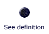
The user should have had a good idea that by clicking the button he/she can navigate to a definition of visibility. Good labelling aids visiblity. It makes clear to the user the relationship that exists between the action (button click) and the effect of that action (in this context, seeing a definition of visibility).
I have also supplied some alternative text which is visible to the user when the mouse passes over the button. This information is particularly useful for users who employ text browsers.
Visibility has nothing to do with the graphical effects that were described above in relation to affordance. The status bar information, the alternative text, and the label are all attempts at aiding visibility.
The term visibility was hijacked by HCI gurus and is in the opinion of many, including myself, an unfortunate one. But there you go, we just have to get on with it.
It is possible to supply a label that has nothing to do with visibility. For example:
In this example the label is a redundant aid to affordance. If the button widget looks like a button it shouldn't need a label saying Click. The label gives no aid to visibility since the user may still have little indication of what to expect when the button is clicked. Although you will note that I have applied some alternative text to comply with the rules of XHTML.
For more on HCI, go to these usabilty guidlines.
⇑ Up to top of page